top of page


VAGRANT
COFFEE
Introduction
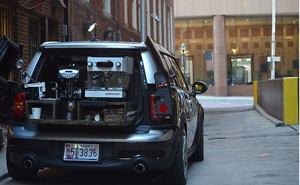
Vagrant Coffee is a Baltimore-based specialty coffee solution that provides a mobile coffee cart for personal consumption, functions, parties, or any event and is part of an accelerator (Accelerate Baltimore). Through the Vagrant Coffee mobile app, downloaded from the App Store, customers can order various types of gourmet beverages for any party size on a given date serviced via the “Carista” coffee car and baristas on the go! We are choosing to design the mobile application interface to enhance the Vagrant Coffee coffee/cart ordering experience by making it more efficient, organized, and overall user-friendly.


WireframeS
We developed four wireframes of the mobile application before prototyping.
For our final prototype, we used select features and screen formats from each sketch.
Sketch #1
.png)


Sketch #2


.png)

.png)
Sketch #3

.png)
.png)
.png)
Sketch #4


Style & Assets

We decided to go for more neutral colors and basic teals as the color palette for our design. The combination of dark shades with white helped give a lot of contrast to the application so that the product is accessible. We chose simple, black icons for a fresh, clean touch and product images with a dark and light teal background as an accent color. Overall, we were going for a minimalist theme, characteristic of many modern coffee and tea shops.


.png)
.png)
.png)

.png)
.png)


The Prototype
Fox & Cat.ttf
Lulo CLean.ttf

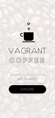
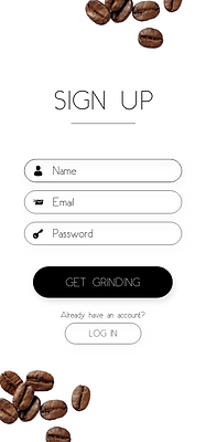
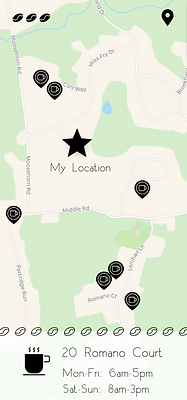
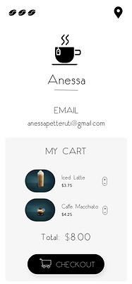
The prototype was created in Adobe XD with over thirty screens, including onboarding, sign up and login, menu bars, ordering, and cart locators. The primary features included a simple five-step ordering in which users could customize their cart with their favorite coffees and teas. They are also able to track their cart as well as locate other carts nearby. The main reason we chose an overall minimalist design was because the Vagrant Coffee mobile app contains many features, and in order for users navigate seamlessly, it needs to be clearly and simply laid out.
I used the Lulo Clean font family for major headings and select button text as well as the Fox & Cat font family for most text and the logo.








User Testing
In order to validate our design and make improvements, we submitted the high-fidelity prototype to UserTesting.com. We presented three users with the scenario: "Envision this - your boss is relying on you to organize a party for six people (including yourself) in a few weeks on November 15, 2019 from 12pm-2pm. Your task involves creating an account and ordering an assortment of coffee/tea beverages through the Vagrant Coffee mobile app. The Vagrant Coffee coffee cart should service the event at your office - the closest cart is at 20 Romano Court."
After receiving user feedback, we can quantitatively confirm that users were able to order a coffee cart for six people as per the completion rate of 100% for all but one tested task. However, only one user was able to view the entire coffee/tea menu (the comprehensive menu). Even though all users were able to view the menu through the “Choose your java” screen, not all were able to view the menu on the “Menu” screen (which they could navigate to via the Home screen by clicking on the “Browse Menu” button on the Home screen). Also as shown in the Time on Task table below, users spent the longest time creating an account, then ordering coffee and tea for a party, then viewing nearby carts, then viewing the entire menu. In terms of error count, only one user made an error when ordering coffee and tea (he did not know how to navigate to the previous screen to alter his order), and one user made an error viewing the entire menu (she was unsure how to get back to the Home screen from viewing the menu since she was unaware of the hamburger menu).
Calculated Metrics
Task
Ordering coffee and tea for a party
Completion Rate
Error Count
Time on Task (seconds)
Viewing the menu
Viewing "Nearby Carts" on the locator screen, clicking on it
Creating an account successfully
3 users (100%)
3 users (100%)
1 user (33.33%)
3 users (100%)
1
1
0
0
99
5
48
103
The above metrics reflect the general intuitiveness of our application. The completion rate of 33.33% for viewing the full menu suggests a potential area for improvement; only one user realized the function of the “View Menu” button on the homepage while the other two users randomly clicked on the button. All users spent about the same amount of time on each task, indicating that our simplistic interface supports easy and efficient usage. We received positive feedback from all users regarding the design and navigation of the app; one user recognized the interface’s intuitive flow and responded that they were never confused throughout the entire process.
Takeaways
Based on our performed user testing and feedback, we brainstormed a few possible improvements for future iterations of the mobile app design:
1. Replace the coffee bean ellipses in the top-left corner with a traditional three-lined hamburger sidebar icon to eliminate confusion.
2. Increase font size/bolding text to establish a hierarchical structure.
3. Address user confusion about navigating out of the locator screen using clearer exit affordance could be implemented (eg. menu icon, back button).
Our testing experience was very straightforward, supported by UserTesting.com’s clear interface. We learned how to curate a proper user test from beginning to end, providing the hi-fi prototype for the users to navigate, and additional follow-up questions to in order to gain greater insight and feedback on our interface. A small challenge was finding where to add user follow-up questions. In addition to receiving successful feedback, we formulated metrics and completion rate calculations that will help us improve the interface in the future.

bottom of page